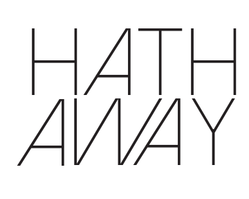
Exhibition poster.
Corita Kent at the warhol
This project is a response to a graphic design assignment in which students imagined an event for which to design materials. I imagined an exhibition of Corita Kent's work at the warhol in Pittsburgh. The brochure, seen below, folds into an 8 x 8 inch square and is designed to open up into a 16 x 32 inch poster of Kent’s entire alphabet. The back cover is arranged before the front cover to show how they correspond.
Back cover.
Front cover.
Page 1.
Page 2.
Page 3.
Page 4.
Page 5.
Page 6.
Inside poster.
Two posters were designed to accompany the exhibition, seen below. The first as an advertisement, and the second as a gift to visitors.
Exhibition poster.
“I really love the look of letters —the letters themselves become a kind of subject matter even apart from their meaning —like apples and oranges for artists.”
The brochure is designed to open up into a 16 x 32 inch poster of Kent’s entire alphabet.
